Visual Identity & Packaging
Design
Overview
UNO FRESH is a toothpaste brand developed for the Russian market, positioned as a natural, India-origin oral care product. The project involved designing a distinctive brand identity and packaging system for multiple toothpaste variants, while ensuring strong shelf presence and market differentiation. The scope of work included logo design for brand registration and packaging design for sales presentation and future production. The brand needed to communicate freshness, effectiveness, and trust, while subtly highlighting its herbal and natural Indian roots in a contemporary, dynamic visual language suitable for an international audience.
Client Brief :
The client planned to launch a new toothpaste line under the brand name UNO FRESH and required:
A registrable logo that is simple, distinctive, and scalable
Packaging designs that could be used to present the product range to the sales team and distributors
A visual identity suitable for the Russian consumer market
Clear communication of the product’s USP: Made in India with natural and herbal ingredients
Key Challenges:
Designing for an international market while preserving subtle Indian authenticity
Creating a cohesive design system across multiple variants:
White
Cool Mint
Clove
Charcoal
Cavity Protection
Ensuring each variant had a distinct visual identity while maintaining a unified brand family
Balancing clinical trust with a dynamic, modern look


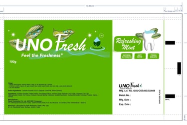
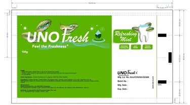
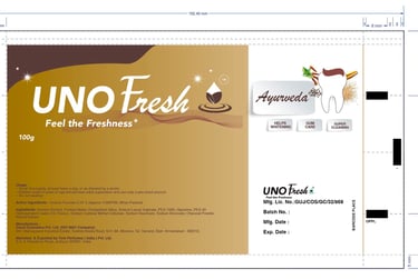
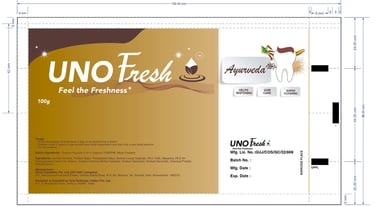
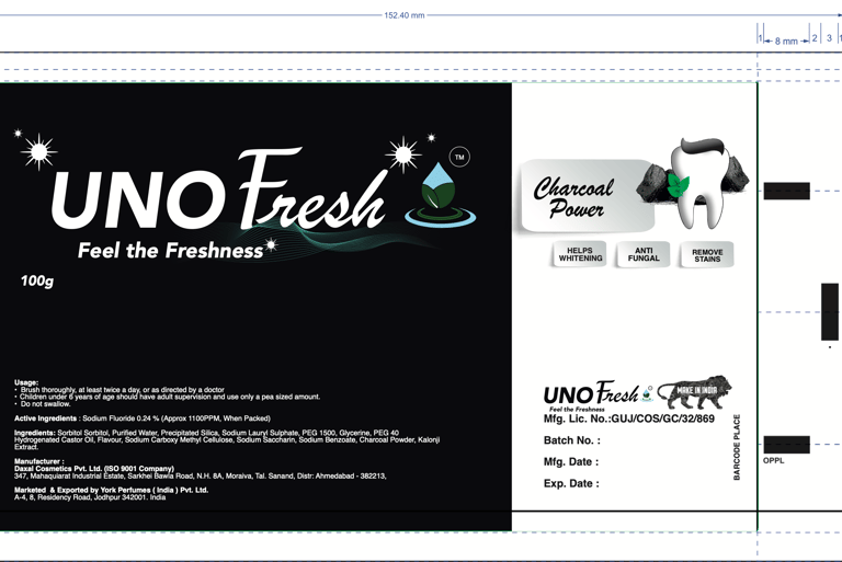
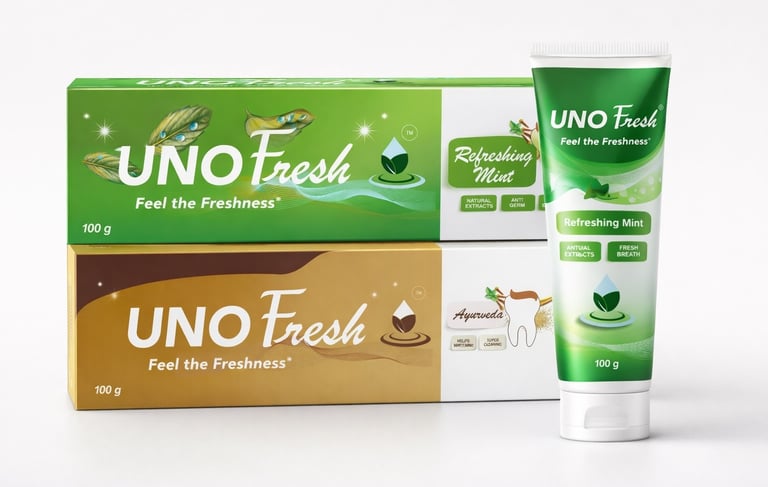
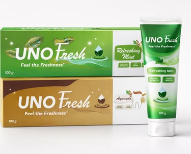
The UNO FRESH logo is a combination mark that blends a water droplet and green leaves to symbolize freshness, cleanliness, and herbal care. A circular ripple suggests activation and daily oral hygiene. The bold, legible logotype reinforces trust and clinical credibility, while the blue green palette evokes nature and freshness. The design is simple, scalable, and suitable for packaging.
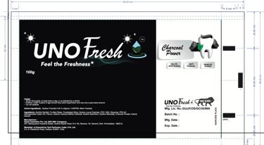
Packaging Design
The packaging was designed as a consistent system for multiple toothpaste variants. A strong front-panel hierarchy highlights the brand, variant name, and key benefits for easy shelf visibility.
Color, ingredient visuals, and graphic waves differentiate each variant while maintaining a unified layout. The design balances freshness, natural cues, and regulatory clarity, ensuring it is print-ready and suitable for international markets.